
Weaving & Homage to the Square: A Closer Look at Two New Mutina Collections

Weaving by Neri & Hu: What a Weave Says About Surface
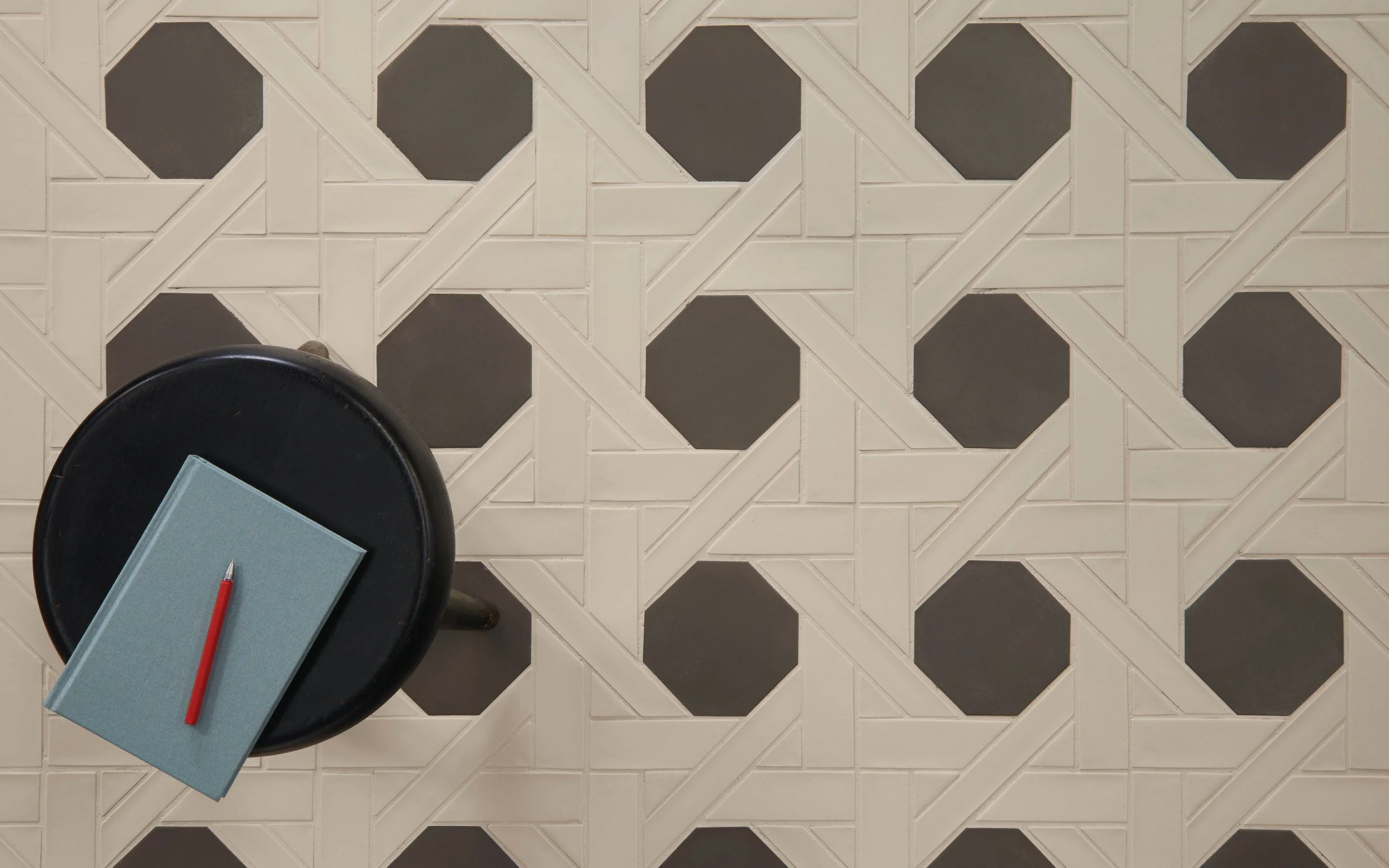
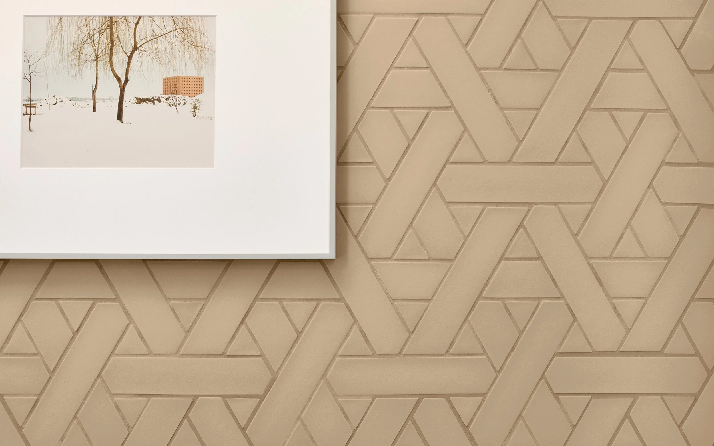
Neri & Hu, the Shanghai-based design and research office led by Lyndon Neri and Rossana Hu, has worked with Mutina since 2026. For Weaving, the starting point was the ancient Chinese art of bamboo weaving. The interest lies less in the motif than in the structure: a weave consists of material and of space between, and only together do they form the image. The collection abstracts this rhythm of solid and void into a graphic language. Colour in the voids creates a second layer of perception and gives the surface depth. The designers' guiding thought: like a single strand of wicker, each element is only a possibility, and it becomes a surface only in combination.
What's interesting is how consistently this carries through into the material. Five through-coloured clay bodies form the base, each with subtle tonal shifts reminiscent of bamboo as it matures. A transparent glaze sits over them like a thin veil. Each format has its own moulds so the three-dimensional structure stays precise, and the elements are released by hand. That keeps the edges intact, and small irregularities become part of the result. The three patterns stand for three weaving techniques: San Jiao (triangle), Si Fang (square) and Ba Leng (octagon). Each sets its own rhythm between dense and open zones. Technically, these are 9 mm homogeneous unglazed porcelain stoneware tesserae, mounted on a net and suitable for walls and floors, indoors and out.
Homage to the Square: Colour as a Question of Perception
Josef Albers, born in 1888, studied and taught at the Bauhaus and later shaped art education at Black Mountain College and Yale. In 1950 he began the series Homage to the Square, which he continued until his death in 1976. The principle never changes: nested squares, recoloured in every painting. The motif stays the same and only the colours change, which is precisely what reveals his interest. Colours alter one another, and we never see them in isolation. His 1963 book Interaction of Color records this insight. His wife Anni Albers, a textile artist and a central figure of modernism in her own right, explored material and structure in weaving, which makes a nice link back to Weaving.
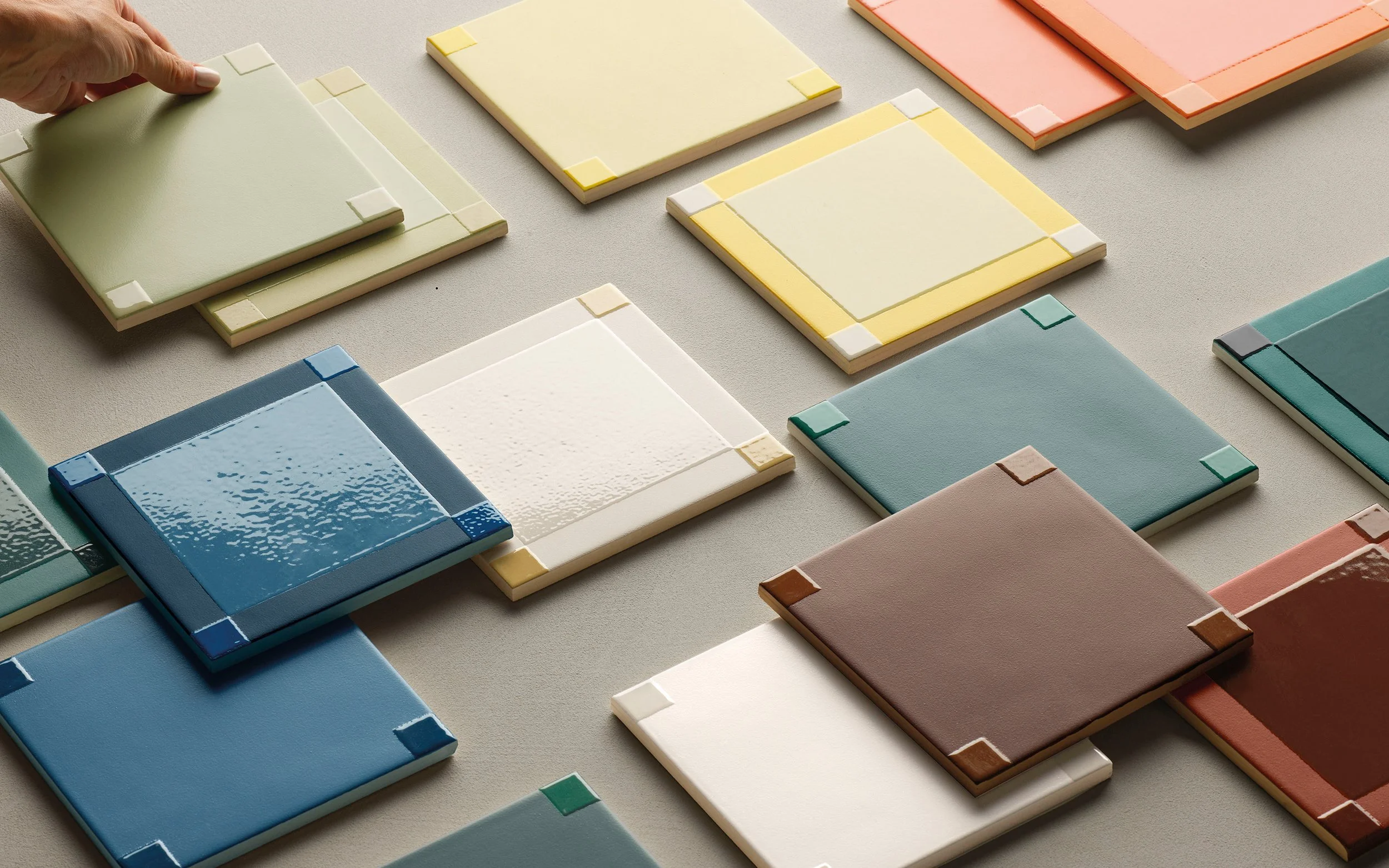
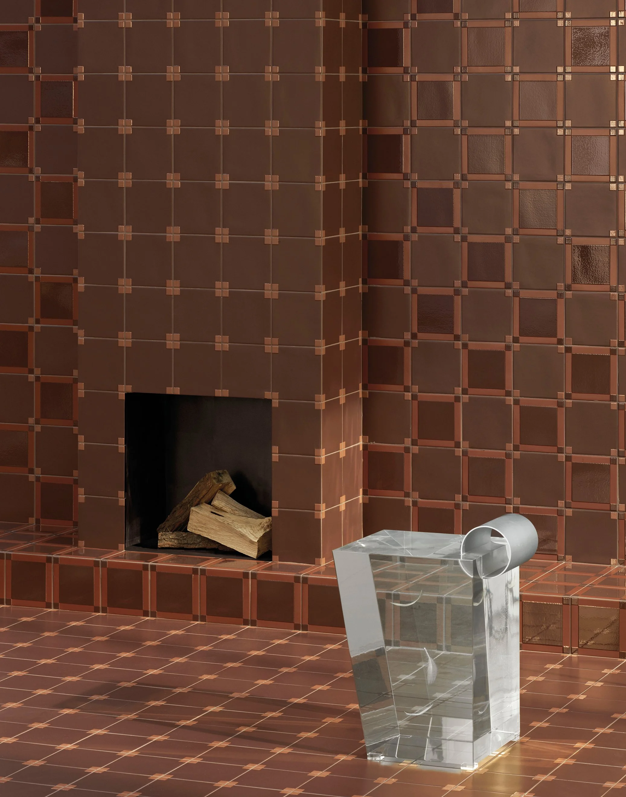
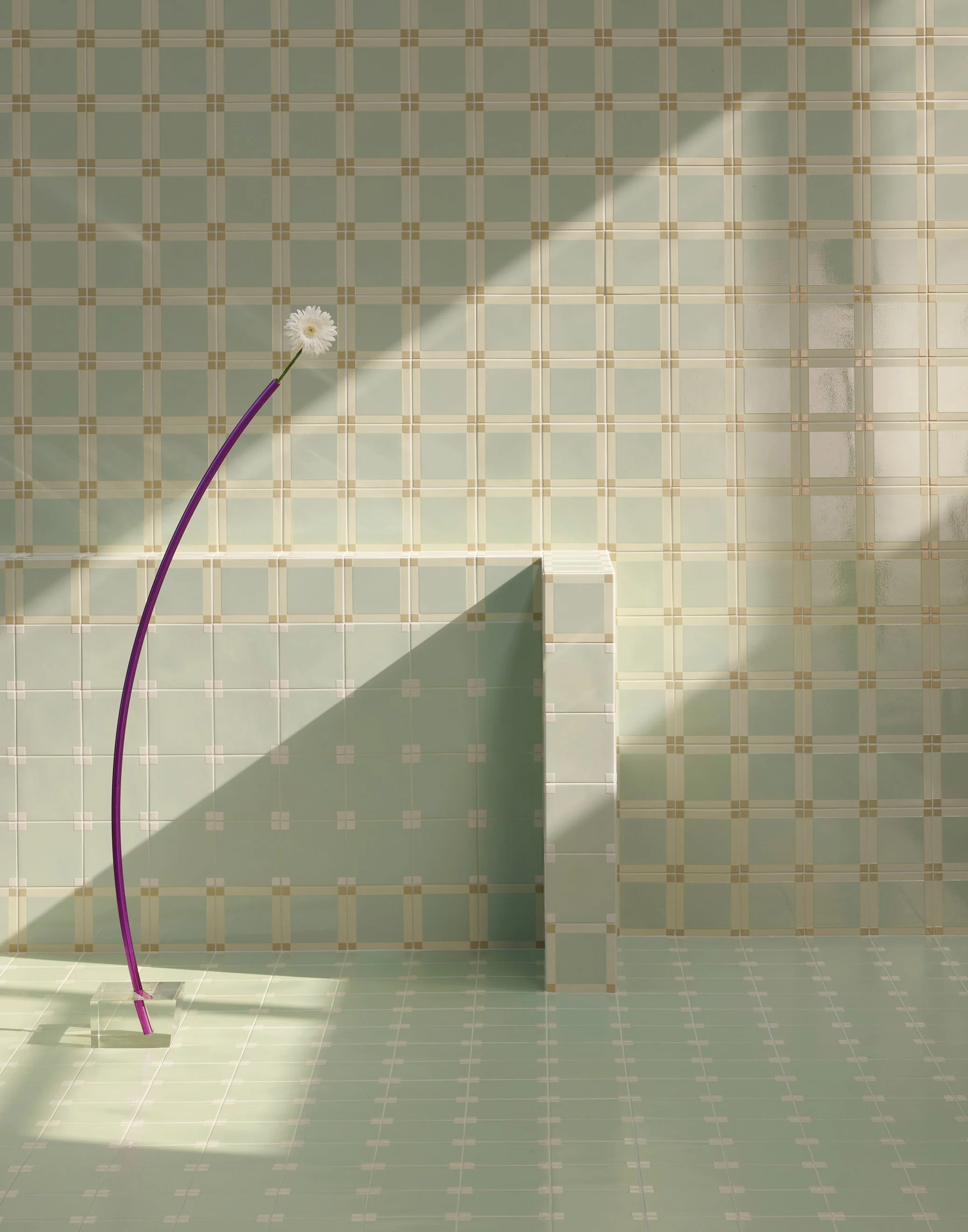
The collection was developed with The Josef & Anni Albers Foundation, and the task was demanding. A painting can't simply be transferred to ceramic, because glaze behaves differently from oil paint. The seven tones (Sea, Evergreen, Chocolate, Ice, Citron, Sage and Peach) therefore required long series of tests with glazes, pigments and firing processes. The aim was to generate different tonal values within one surface while keeping saturation and definition consistent. Washes, overlays and glaze applications build up the colour layers, and matte and glossy areas emerge through precise control of how the materials react.
The format follows the source too. In Albers's work, the square is less a motif than an experimental set-up, a neutral frame in which colour can be observed. The 15×15 cm elements are glazed, unrectified porcelain stoneware, 9 mm thick, and they show the natural variation of the firing. In the Dash and Dot patterns, the square is repeated and varied.
Two Routes, One Understanding of Ceramics
Both collections combine artisanal knowledge with modern manufacturing and are free of VOCs. Above all, they take their sources seriously: a craft tradition on one side, a lifetime of colour research on the other. That combination of material, technique and thought is what we appreciate about Mutina.
Samples from both collections are now in our showroom in Zürich. If you'd like to see and touch them, you're welcome to book an appointment.